AQUAZZURRO
- CLIENT / AQUAZZURRO
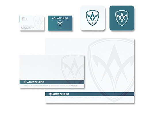
DATE / 2007 - コーポレートカラーは水と空の普遍性とクリア感をイメージ。シンボルマークは、安心と信頼を表す盾を輪郭に、高感度と勤勉の象徴である蜂の触角と社名頭文字を表現。
- The corporate color is based on an image of eternity and clarity of water and sky. The symbol mark is the outline of a shield which represents safety and reliability. We added the antennas of a bee – a symbol of sensitivity and hard work, plus the initial letter of the company name.